
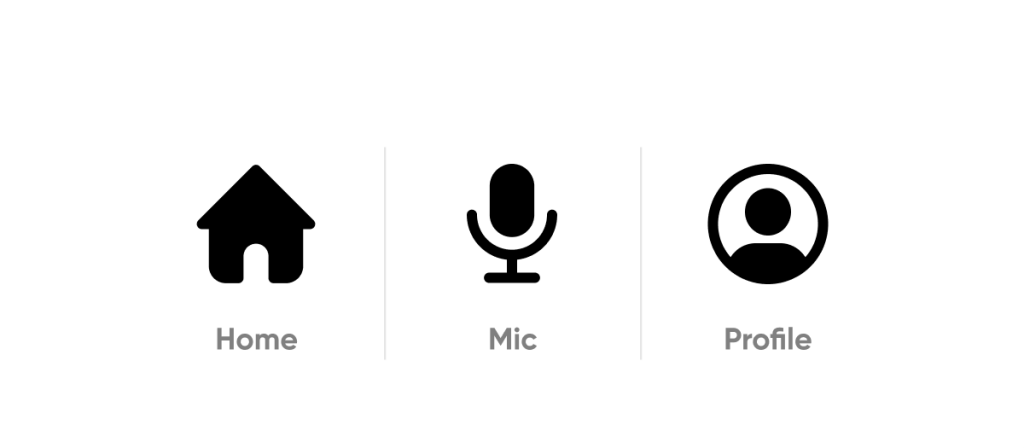
When we see a cogwheel icon, even if it doesn’t say “settings,” we instinctively know which page it will lead to. We can create examples with a magnifying glass and a trash can. We don’t even read the label underneath. In fact, children can use tablets and play games without knowing how to read. Of course, the colors and button placements play a role in this.
I will address the topic at the level of icons (symbols) used in interface designs, not at the level of pictograms (warning signs, traffic signs). As designers, creating every icon from scratch can be an unnecessary workload. There are many paid and free resources that offer these icons, such as material icons and thenounproject, which I shared in a previous design tools article. So, how do we choose the icon library that suits our project among so many options? Let’s start by understanding general types of icons.
Icon Type
We can categorize these into three main categories: Outline, Solid, and Duotone. Of course, we can also add various styles like 3D and glassmorphism, but let’s continue with the most commonly used ones for now.
Outline icons are those with only the line thickness defined. We can choose between different line thicknesses such as regular, light, and thin to find the one that suits our project. Consistency is crucial, so it’s important that the icons in the project have the same line thickness.

Solid icons are the filled versions of outline icons. You can either use a complete set of solid icons or show the solid version of an outline icon to indicate that it’s selected or active.
Duotone is one of the preferred methods to make the project’s color identity more dominant. While they may look more fun, they can lead to accessibility issues in some colors and icons.

No matter how extensive your icon library is, there will come a point where you can’t find the icon you want in the style you need. For example, when working on a website with a holiday theme, icon libraries may eventually fall short. In such cases, we’ll need to open Figma and consider the following criteria.
Icon First
Designing our own icons will better express the project’s uniqueness and integrity. These icons we design should be simple and straightforward since they directly guide the user to take action.
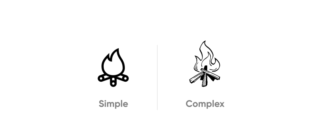
Icons are typically used in menus, navigation areas, or within buttons at small sizes like 24 px. Therefore, it’s advisable to avoid complex shapes as their visibility decreases as they get smaller.
4 Step
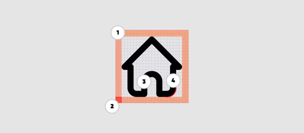
In Figma, we start by opening a blank page.
Frame: A 24 x 24 px grid is an excellent starting point for creating beautiful icons. Icons can come in various sizes, but each one should be square. Other commonly used icon dimensions include 16×16, 20×20, 24×24, and 32×32 px.
Safe Area: To ensure the icon works well within the space, provide a 2 px padding from the corners. Icons might not be square or circular, in which case, the widest area should fit within the safe area. While it’s okay to sometimes exceed this area, remember to maintain harmony when placed alongside other icons.
Stroke Thickness: Working with a stroke thickness of 1.5 px will look good on many devices. Different thicknesses can be preferred for various sizes, and you can add them as alternatives in the project, such as regular, light, and thin.
Corner Radius: To maintain consistency among icons, the corner radius should be the same throughout the project. The radius value can be 0px (sharp) or 2 px (rounded).
Finally, you can add the icons to your project in .svg format, or for web projects, define these icons as fonts and load them as a single font file. This can provide advantages in terms of SEO. You can try IcoMoon for creating font icons.
For more technical details, you can refer to the Material Design Icon guide.